
Your Community Early Learning
We helped Early Learning execute their new brand and website identity, crafting a fun and vibrant brand that evokes imagination and learning.


About The Project
The Client
Your Community Early Learning is the most recent addition to the CCLPC umbrella. Your Community currently has 3 Childcare & Kindergarten centres open in Victoria, with another 3 opening soon in South Australia and Victoria.
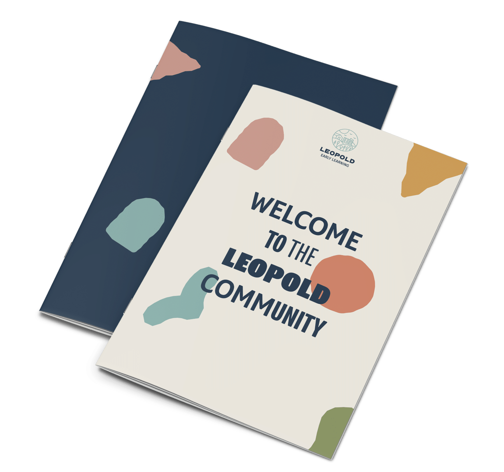
The idea behind the brand is that you become ‘A Part of the Community, to help drive that message – each centre begins with the suburb name… i.e Leopold Early Learning. The client aims to deliver unique, affordable and quality childcare centres with modern facilities, unique play areas, and take-home meals for all those busy parents out there!
The Objective
Hopscotch was tasked to rebrand the company to breathe new life and inspiration to the brand, as well as design and develop all their individual centre websites with CRM Integration, advanced tracking implementation – and clear user journeys and experience. Our goal is always to nurture the leads through the website, and have an efficient way of enrolling or enquiring.
The Solution
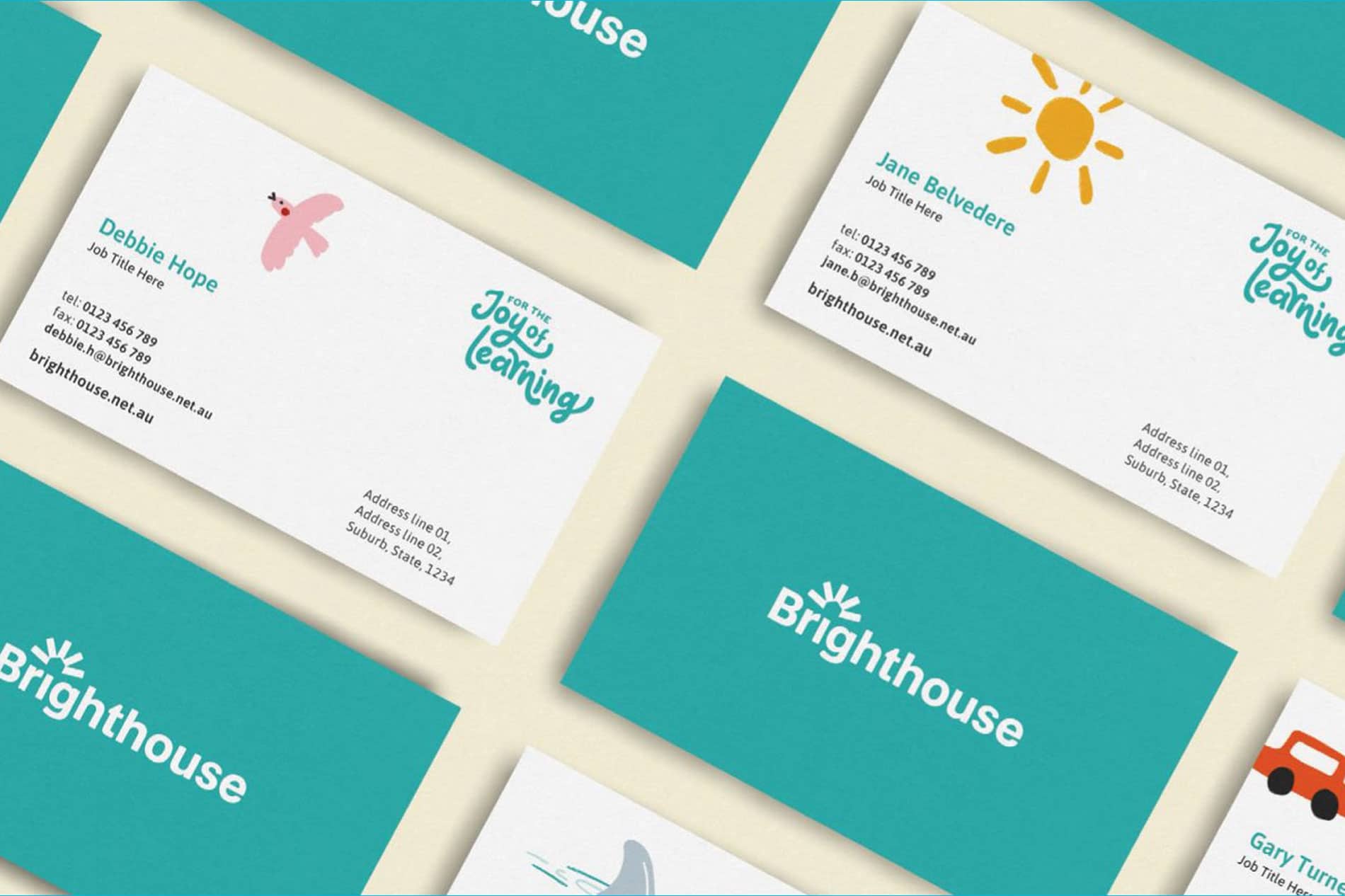
The Logotype: The logotype has been developed using traditional and ‘human’ typefaces originally used for large print forms. The fonts hark back to a time of handwritten signage found throughout a village market — exuding a certain level of hands-on humbleness. Consideration has been taken to ensure that the logotype can be adjusted to accommodate any future centres.
Colour Palette: The hero deep navy colour paired with a softer ‘eggshell’ is engaging and fun whilst reflecting a high-quality and premium service. Taking the creative direction into account, we have extended the colour palette to utilise a variety of bright yet slightly muted complementary tones.
Typography: Program OT has been selected as the brand’s headline typeface. There are a number of different weights and it has both a condensed and normal cut, offering a breadth in flexibility and customisation for unique and interesting graphic treatments.
Illustration Style: The illustrative elements have been derived from the various forms within the logo. The edges have been roughened to give it a tactile, cut-out feel and expression. This brings a welcoming and ‘hands-on’ feel to the brand, promoting a certain level of child-like joy and expressionism.
Feedback
“We have worked with Hopscotch Digital to create multiple brand concepts, websites and digital marketing campaigns. The team are attentive to our specific needs in the childcare industry and are knowledgeable in web development, design, ad words and social media which has assisted in driving enquiries. We will continue to use Hopscotch Digital for all our future online requirements.”
Chris Sacre
Founder
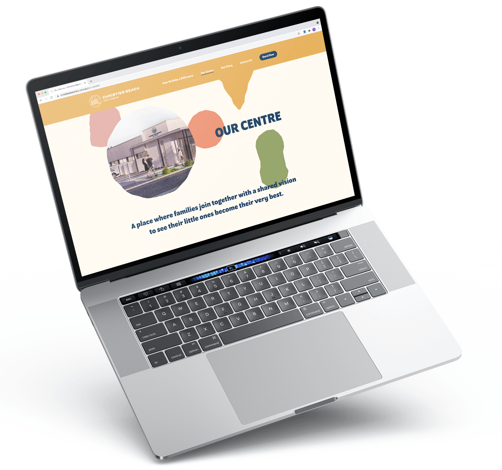
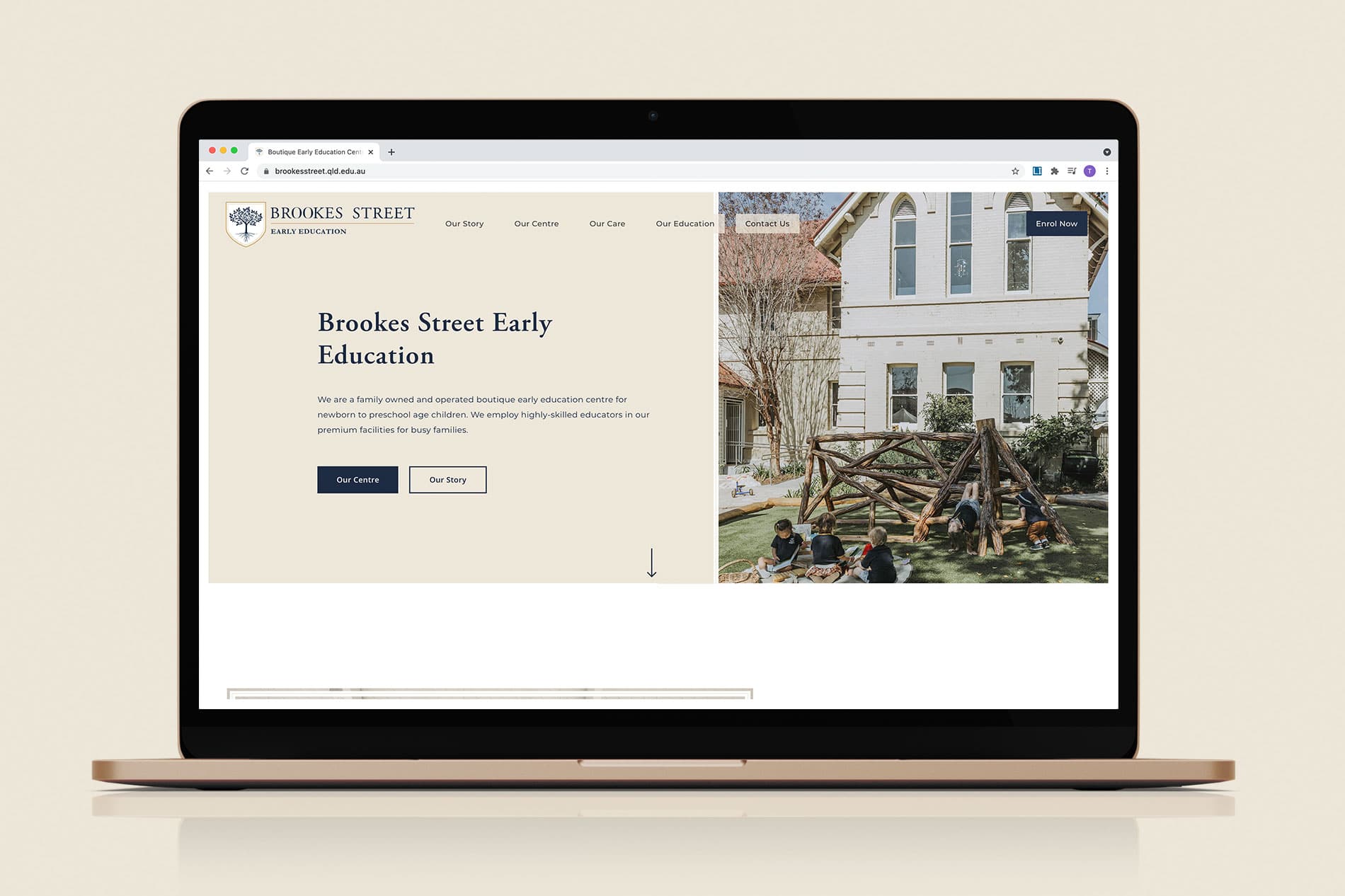
Website Design & Development
Great branding always leads to designing and developing a website a whole lot more efficiently. Your Community Early Learning requested unique separate websites for each of their centres’ both present and future. Each website has its own unique content and colour assigned to each, whilst being user-friendly and Google friendly.
Branding
The Early Learning brand needed revitalising to evoke more of a playful and childlike nature of wonder.
And… Let’s be honest; we nailed it.
A vibrant work culture that flows with creativity is our secret


")
View Similar Projects

Let's Bring Your Vision to Life
Contact Hopscotch Digital and let's have a coffee - on us
Contact Hopscotch