Brighthouse came to us here at Hopscotch Digital in need of a complete re-brand, and website update. We focused on a playful and aspiring UI, while still making sure the UX was functional.
Brighthouse

About The Project
The Client
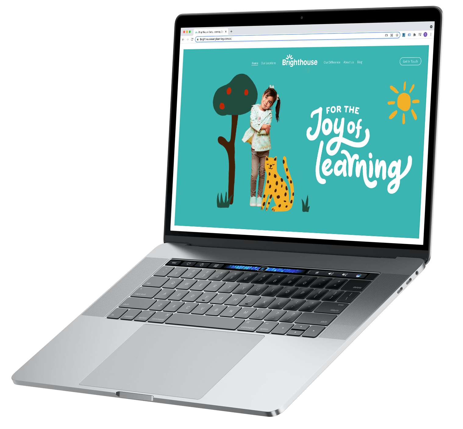
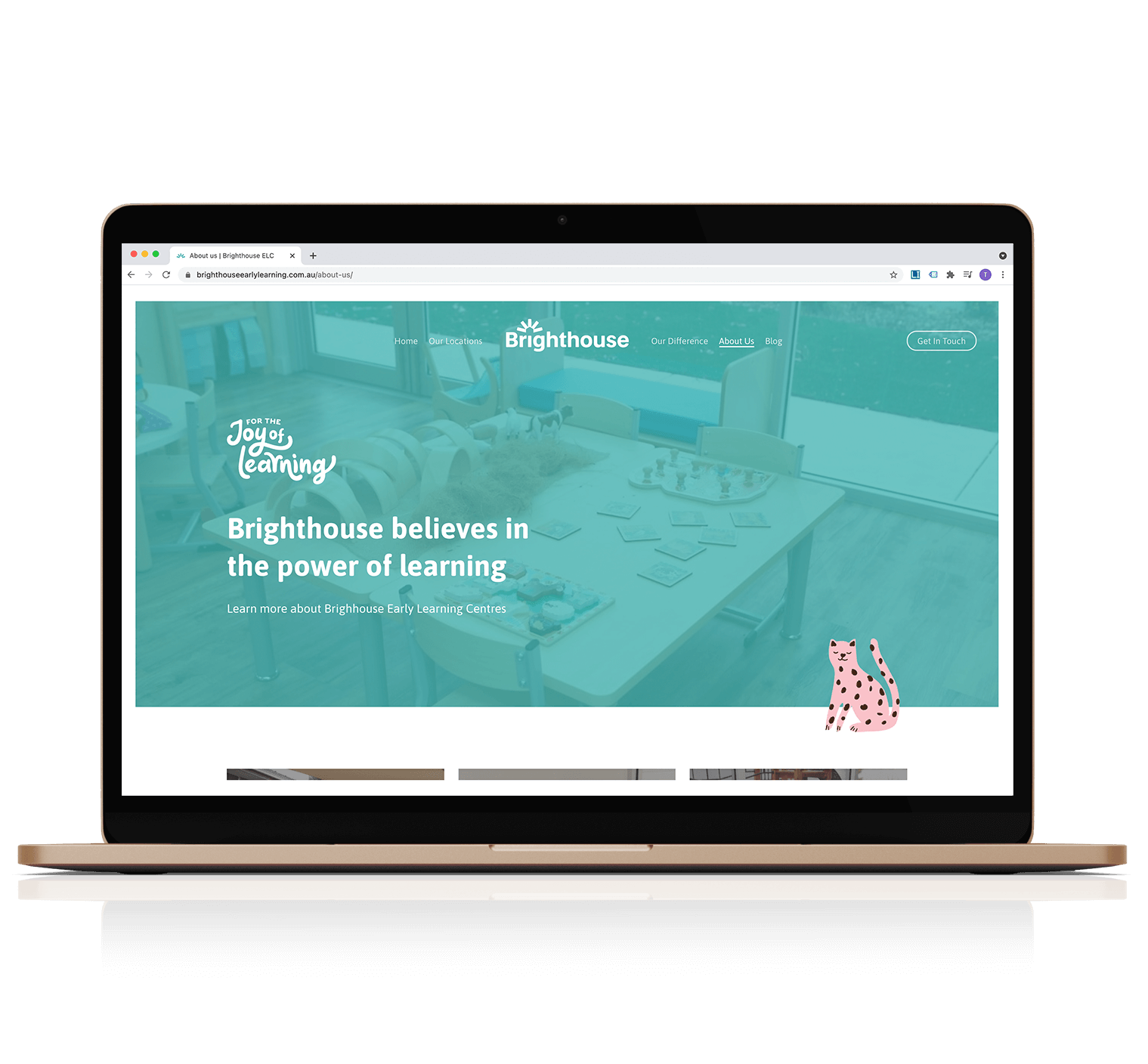
Brighthouse, or Brighthouse Early Learning, is a new early learning centre offering high-quality education and childcare for children aged six weeks to six years. Brighthouse came to us here at Hopscotch Digital in need of a complete re-brand, and website update. We focused on a playful and aspiring UI, while still making sure the UX was functional. Want to explore for yourself? Click here.
The Solution
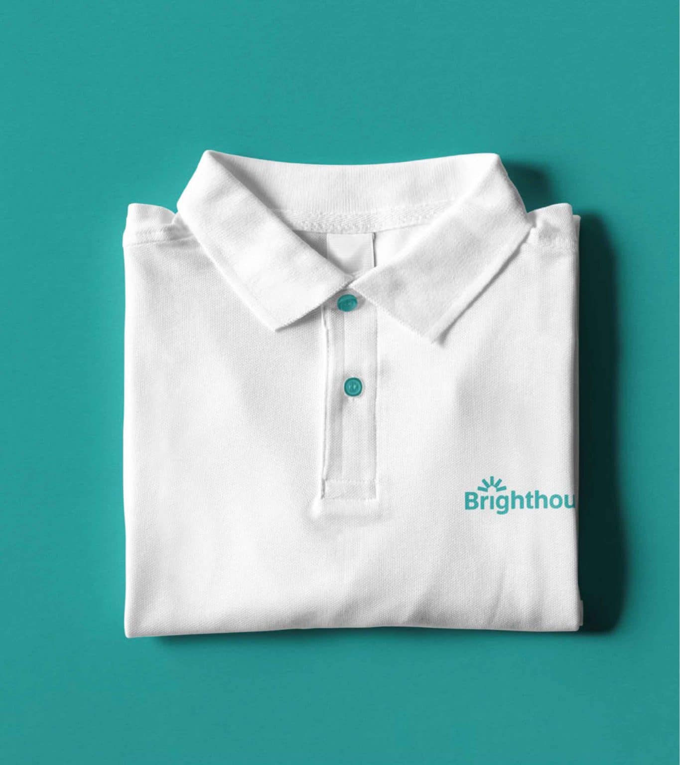
The Logo: We began the logo exploration by looking at the name ‘Brighthouse’ for inspiration. Splitting the name into two parts, ‘bright’ and ‘house’ we began crafting an icon that had a modern, minimal and high-quality appearance. The lines are symbolic of both radiating light but also of the community coming together for a common good. The house formed in the negative space conveys the idea of a safe, compassionate and caring environment. The resulting marque has a bold, impactful appearance and conveys the premium service offering.
From here, we looked to combine the icon with a bold and contemporary wordmark. The chosen letterforms convey a friendly, fun and welcoming tone whilst retaining a dependable, trustworthy and high-quality appearance. Placing the icon above the ‘i’ in ‘Brighthouse’ ties the two elements together and creates and unified, cohesive and elegant logo lockup.
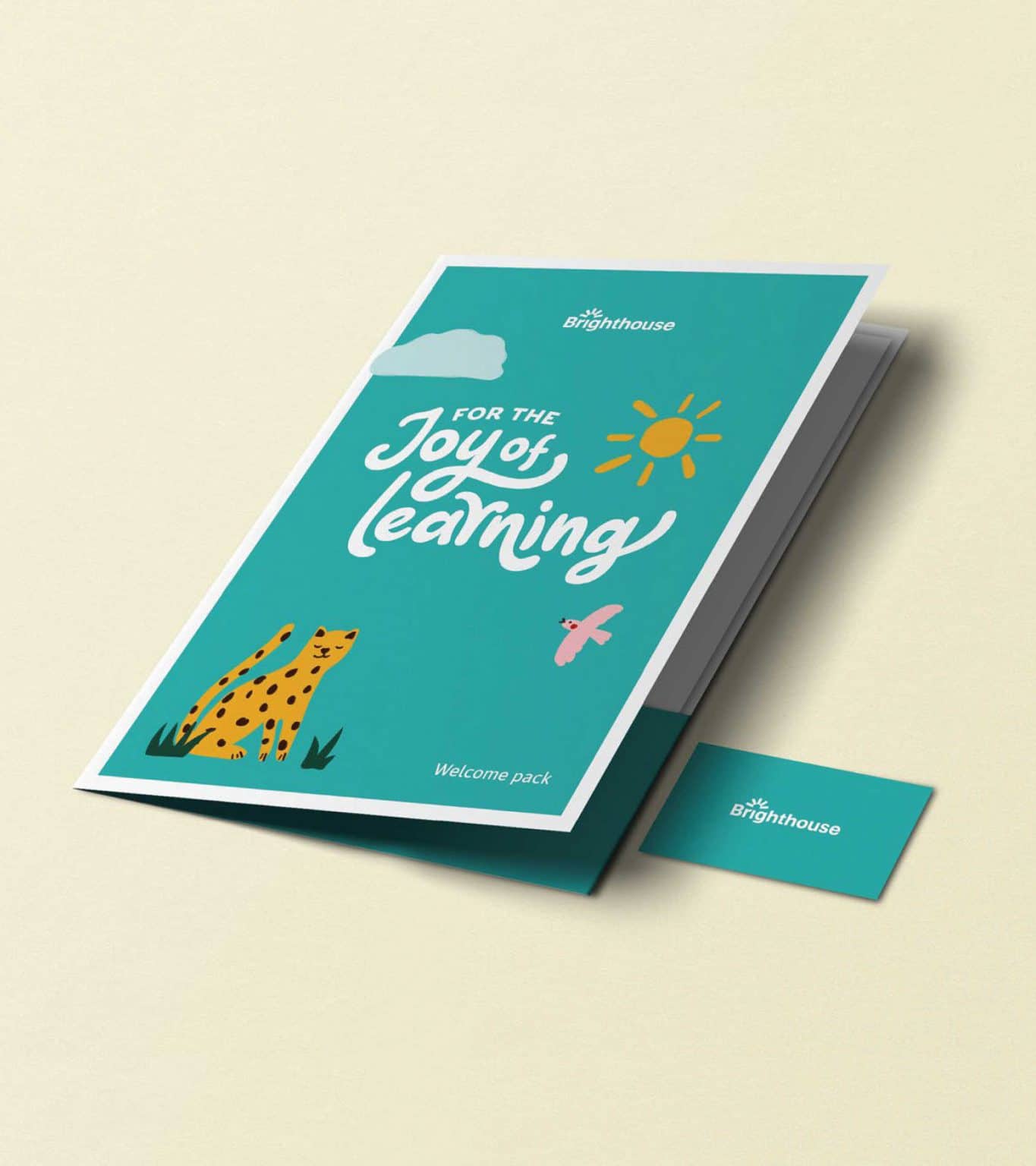
Tagline Graphic: In addition to the Brighthouse logo, we have crafted a custom tagline graphic that conveys a sense of fun and expresses the ‘joy of learning’ sentiment. This graphic has been designed to contrast and compliment the master logo and has the ability to be used as a hero graphic or as a sign-off on branded materials.
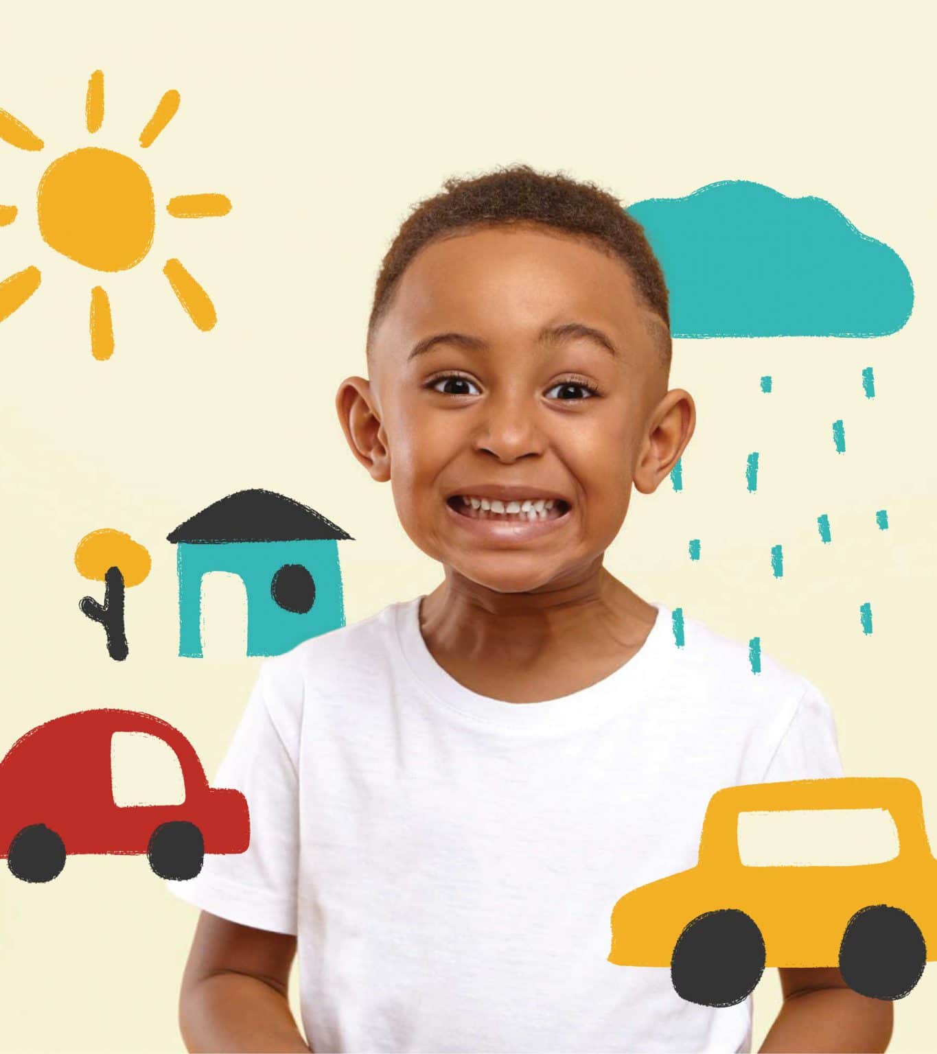
Illustration Style: Inspired by the creative direction, we have developed an illustration style that celebrates imagination and expresses the brand ethos – ‘for the joy of learning’. This style has a cute, friendly and naive aesthetic and depicts elements typical to a child’s imagination. These illustrations can be used in isolation, in illustrative compositions or paired with and interacting with photography.
Services Deployed
- Branding
- Website Design & Development
- Strategy & Analytics
Feedback
“We have worked with Hopscotch Digital to create multiple brand concepts, websites and digital marketing campaigns. The team are attentive to our specific needs in the childcare industry and are knowledgeable in web development, design, ad words and social media which has assisted in driving enquiries. We will continue to use Hopscotch Digital for all our future online requirements.”
Chris Sacre
Founder
Website Design & Development
Branding